Page 1 of 1
| A more complete icon 13/10/2012 at 16:38 #36446 | |
|
alvinhochun
249 posts |
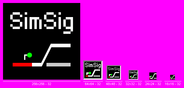
I've spent some time to fix the icons a bit. Currently there is only a 4-bit 32x32 icon that doesn't show well either as a small icon or a large icon. The fact is: since Windows Vista, it already supports 256x256 icons! So I've added 16x16, 24x24, 48x48, 64x64 and 256x256 icons. Basically the look doesn't change much, but to me, it's better, especially for the 16x16 one that is always used on start menus and Windows Explorer. However you think, either good or bad, feel free to leave a comment. I left the text pixelated because I want to keep the feeling that, the appearance of the signal box is a bit old-fashioned. As this is derived from the original SimSig icon, SimSig developers and the original designer always have the full right to make use of it, modify it or deny it. Here's a preview:  And here's the actual icon file, zipped: [attachment=656]SimSig.ico.zip[/attachment] Post has attachments. Log in to view them. Last edited: 13/10/2012 at 16:42 by alvinhochun Log in to reply The following user said thank you: GeoffM |
| A more complete icon 13/10/2012 at 16:53 #36448 | |
|
Splodge
720 posts |
A nice idea. Personally I think the large icons need high quality text; it simply looks forgotten about otherwise, especially with a junction that looks so perfect!
There's the right way, the wrong way and the railway. Log in to reply |