Page 1 of 4
| Legacy-look Timetable CSS 30/06/2020 at 19:37 #128648 | |
|
TylerE
160 posts |
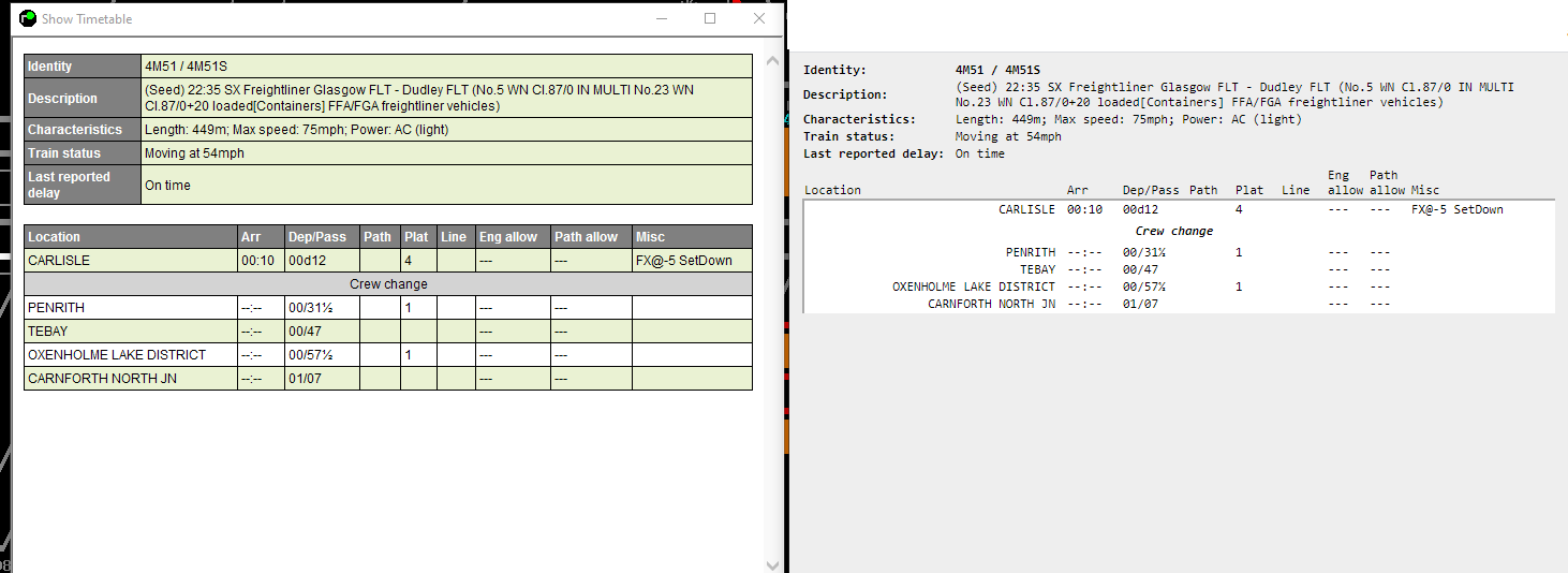
 So, with the announcement that the next version of the loader will support a user-specified CSS file for the timetable popups, I knew immediately what had to be done... Changes: * All distracting visual elements eliminated (Borders, zebra striping, colors) * Monospaced font throughout * Location names right aligned * : added after field headers in top section * Column widths tweaked Right now this was just developed in chrome so it will require some tweaking once the loader update is released and I can see how things render in whatever version of IE the loader embeds.  Post has attachments. Log in to view them. Log in to reply The following users said thank you: PilotDean21, Dick, belly buster, torets |
| Legacy-look Timetable CSS 30/06/2020 at 19:41 #128650 | |
|
agilchrist
258 posts |
Thats hideous ! Thank goodness I can never have it like that. Blessed are the true believers, for only they shall walk the Path, and they shall be welcomed unto the realm of the Ori and made as one with Them. Log in to reply The following users said thank you: VInce, Hap, andyb0607 |
| Legacy-look Timetable CSS 30/06/2020 at 19:42 #128651 | |
|
GeoffM
6412 posts |
TylerE in post 128648 said:* All distracting visual elements eliminated (Borders, zebra striping, colors)Interesting how I find your version incredibly difficult to read with the visual cues removed. Each to their own, I guess. SimSig Boss Log in to reply The following users said thank you: DriverCurran, VInce, andyb0607, jc92 |
| Legacy-look Timetable CSS 30/06/2020 at 19:53 #128654 | |
|
Dick
399 posts |
GeoffM in post 128651 said:TylerE in post 128648 said:* All distracting visual elements eliminated (Borders, zebra striping, colors)Interesting how I find your version incredibly difficult to read with the visual cues removed. Each to their own, I guess. Indeed, whereas I find TylerE's version far easier to take in at a glance than the new version. I suspect it has as much to do with familiarity as anything else though. Log in to reply The following user said thank you: pebbens |
| Legacy-look Timetable CSS 30/06/2020 at 19:53 #128655 | |
|
PilotDean21
13 posts |
I'll be interested to see how this develops. I too prefer the look without the borders etc, and find the new train list takes up quite a lot of screen real estate to display TTs. Log in to reply |
| Legacy-look Timetable CSS 30/06/2020 at 19:54 #128656 | |
|
VInce
579 posts |
You are a very clever chap, Tyler. Not everyone could make it look as bad as that. Each to their own but to me it looks like something created in MS-DOS 1.1- remember that? You can take it as read that I won't be asking you to come and redesign my living room decor though! Vince I walk around inside the questions of my day, I navigate the inner reaches of my disarray, I pass the altars where fools and thieves hold sway, I wait for night to come and lift this dread away : Jackson Browne - The Night Inside Me Last edited: 30/06/2020 at 19:59 by VInce Reason: None given Log in to reply The following users said thank you: GeoffM, Meld, y10g9, jnjkerbin, Phil-jmw, phil1044, jc92, andyb0607 |
| Legacy-look Timetable CSS 30/06/2020 at 19:55 #128657 | |
|
Meld
1116 posts |
VInce in post 128656 said:You are a very clever chap, Tyler. Not everyone could make it look as bad as that.+1 Passed the age to be doing 'Spoon Feeding' !!! Log in to reply |
| Legacy-look Timetable CSS 30/06/2020 at 20:01 #128659 | |
|
DavidSplett
142 posts |
GeoffM in post 128651 said:TylerE in post 128648 said:I have to say out of the various changes I'm not overly keen on the new timetable, and having played several hours on King's Cross yesterday I didn't find myself any more comfortable with it by the end.* All distracting visual elements eliminated (Borders, zebra striping, colors)Interesting how I find your version incredibly difficult to read with the visual cues removed. Each to their own, I guess. In an ideal world there would be a choice between new and old, to cater for all tastes. Not sure if that's an option which could viably be provided? Log in to reply The following user said thank you: Dick |
| Legacy-look Timetable CSS 30/06/2020 at 20:12 #128661 | |
|
TylerE
160 posts |
VInce in post 128656 said:You are a very clever chap, Tyler. Not everyone could make it look as bad as that.Now you know how those of us who don't like the v5 changes feel. Except we weren't given the choice! Log in to reply |
| Legacy-look Timetable CSS 30/06/2020 at 20:18 #128662 | |
|
GeoffM
6412 posts |
TylerE in post 128661 said:VInce in post 128656 said:So in a thread you started about CSS where you can customise the look and feel, you're now saying you were not given the choice of the look and feel. Logic?You are a very clever chap, Tyler. Not everyone could make it look as bad as that.Now you know how those of us who don't like the v5 changes feel. Except we weren't given the choice! SimSig Boss Log in to reply The following users said thank you: VInce, Hap, DriverCurran, Meld, jnjkerbin, jc92 |
| Legacy-look Timetable CSS 30/06/2020 at 20:21 #128663 | |
|
TylerE
160 posts |
So nice to be treated with such respect as someone how has spent hundreds of dollars on sims over the years.
Log in to reply |
| Legacy-look Timetable CSS 30/06/2020 at 20:21 #128664 | |
|
agilchrist
258 posts |
TylerE in post 128661 said:Change always brings criticism, there are always a small amount of people who resist change. There are others that will embrace the change. If you can not be positive about it then best to not just criticise because not everyone will see your point of view. I would rather not have your opinion of how it should looked rammed down my throat, if this is what you want it to look like then so be it. Blessed are the true believers, for only they shall walk the Path, and they shall be welcomed unto the realm of the Ori and made as one with Them. Log in to reply The following users said thank you: VInce, andyb0607 |
| Legacy-look Timetable CSS 30/06/2020 at 20:46 #128666 | |
|
lazzer
642 posts |
On a related note ... I don't know if it's been acknowledged (or even seen), but in post #128519 in the "Loader V5 Released" thread, I asked if it would be possible to display train stops in the TT window in bold. I have nothing against the new display, but I find the "zebra stripes" slightly distracting when trying to pick out whether a train is stopping or passing through a station. Log in to reply The following users said thank you: UKTrainMan, pebbens |
| Legacy-look Timetable CSS 30/06/2020 at 20:52 #128667 | |
|
ajax103
1128 posts |
It may be the fact that I have used the regular SimSig design for a while or the fact that I don't like change for change's sake but the proposed CSS design I'm sorry but I couldn't get used to it. Yes it's a positive that maybe now we can have our own CSS designs but I'm contend with the SimSig one except maybe just one tiny little thing and I leave it to the community to see what they think but is it possible to keep the existing SimSig design BUT have the stopping pattern appear as the rail industry's CCLDB site does ie stopping locations in Bold and passing locations in regular type? Nothing would change apart from the above formatting, I don't know how CSS works or how it's possible to change it so it does that for my use only but I think it's something that could be discussed. I've attached a screenshot of the CCLDB page below.  Post has attachments. Log in to view them. Log in to reply The following user said thank you: UKTrainMan |
| Legacy-look Timetable CSS 30/06/2020 at 20:53 #128668 | |
|
UKTrainMan
1803 posts |
lazzer in post 128666 said:On a related note ...+1 for the idea / request for train stops to be emboldened or perhaps somehow appear differently to passing times. Any views and / or opinions expressed by myself are from me personally and do not represent those of any company I either work for or am a consultant for. Log in to reply |
| Legacy-look Timetable CSS 30/06/2020 at 20:59 #128669 | |
|
GeoffM
6412 posts |
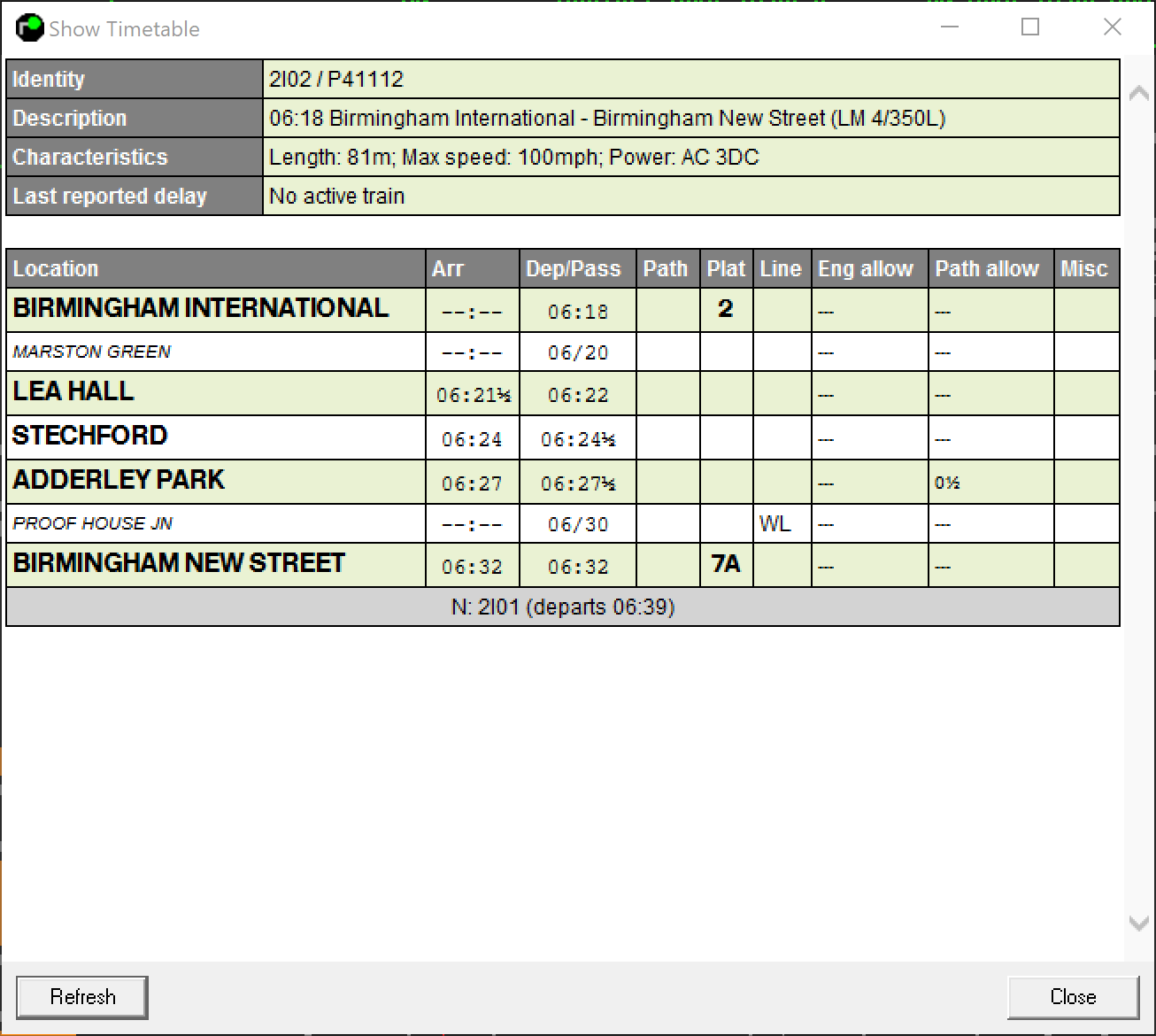
lazzer in post 128666 said:On a related note ...Apologies for not acknowledging your post, but I have partially incorporated this already. Example attached, but ignore the colour scheme - just playing around for demo purposes. You'll be able to lose the zebra types in the CSS. 
Post has attachments. Log in to view them. SimSig Boss Last edited: 30/06/2020 at 21:00 by GeoffM Reason: None given Log in to reply The following users said thank you: ajax103, pebbens, UKTrainMan, lazzer |
| Legacy-look Timetable CSS 30/06/2020 at 21:17 #128672 | |
|
lazzer
642 posts |
GeoffM in post 128669 said:lazzer in post 128666 said:Ah yes - putting them in a different colour is a perfect solution. So, just so I understand this - at some point in the future we'll be able to edit the CSS file to change these things for ourselves?On a related note ...Apologies for not acknowledging your post, but I have partially incorporated this already. Example attached, but ignore the colour scheme - just playing around for demo purposes. You'll be able to lose the zebra types in the CSS. Log in to reply The following user said thank you: UKTrainMan |
| Legacy-look Timetable CSS 30/06/2020 at 21:19 #128673 | |
|
GeoffM
6412 posts |
lazzer in post 128672 said:GeoffM in post 128669 said:Correct!lazzer in post 128666 said:Ah yes - putting them in a different colour is a perfect solution. So, just so I understand this - at some point in the future we'll be able to edit the CSS file to change these things for ourselves?On a related note ...Apologies for not acknowledging your post, but I have partially incorporated this already. Example attached, but ignore the colour scheme - just playing around for demo purposes. You'll be able to lose the zebra types in the CSS. SimSig Boss Log in to reply The following users said thank you: lazzer, UKTrainMan |
| Legacy-look Timetable CSS 30/06/2020 at 21:21 #128674 | |
|
lazzer
642 posts |
GeoffM said:That should do the trick nicely. Cheers. Log in to reply |
| Legacy-look Timetable CSS 30/06/2020 at 21:56 #128679 | |
|
Meld
1116 posts |
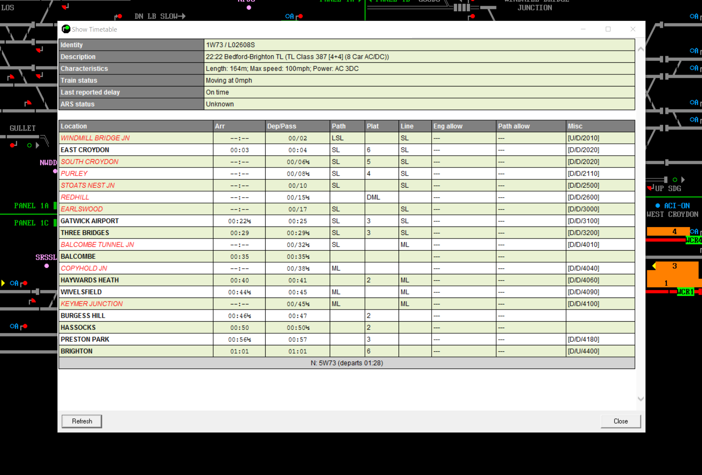
My take on a Geoffs version  Post has attachments. Log in to view them. Passed the age to be doing 'Spoon Feeding' !!! Log in to reply |
| Legacy-look Timetable CSS 30/06/2020 at 23:59 #128689 | |
|
TylerE
160 posts |
VInce in post 128656 said:You are a very clever chap, Tyler. Not everyone could make it look as bad as that.The point is to make it look like Simsig has looked forever, and which was perfectly readable and functional. What it CAN'T do is fix all of the other ways the v5 timetable is inferior - that it OPENS A WEB BROWSER, with noticeable delay, has unpredictable placement, and is just generally an inferior user experience. The intent though, is to make it suck the minimal amount absolutely necessary. Now, I am certainly open to producing a version that is more aesthetically pleasing, but as an initial vector of attack I'm just trying to get back to the way things *were*. Log in to reply |
| Legacy-look Timetable CSS 01/07/2020 at 00:10 #128690 | |
|
DavidSplett
142 posts |
One suggestion: An issue I found was the various numbers aren’t as distinctly placed as before, so with running a busy sim this means it takes time to digest rather than be able to extract info at a glance. It would help if the engineering and pathing allowances were noted as they are in the timetable, eg [4] and (4). This would be really helpful, as it would avoid getting mixed up with platform numbers. Last edited: 01/07/2020 at 00:10 by DavidSplett Reason: None given Log in to reply |
| Legacy-look Timetable CSS 01/07/2020 at 00:23 #128691 | |
|
TylerE
160 posts |
Unfortunately do the limitations of CSS I really can't do that sort of thing. I can append a character (always) like I do in the header, but can't actively reformat things. I could do these things if the markup had semantic information, so something like <span class="passing-time">4</span> but I can't just transform text. Edit: Actually, that was based on the markup as currently output by 5.2 If the wiki page at https://www.SimSig.co.uk/Wiki/Show?page=usertrack%3Assrun%3Acss means what I think it means, this is actually totally doable. Last edited: 01/07/2020 at 01:16 by TylerE Reason: None given Log in to reply |
| Legacy-look Timetable CSS 01/07/2020 at 00:47 #128692 | |
|
Hap
1084 posts |
TylerE in post 128691 said:Unfortunately do the limitations of CSS I really can't do that sort of thing. I can append a character (always) like I do in the header, but can't actively reformat things. I could do these things if the markup had semantic information, so something like <span class="passing-time">4</span> but I can't just transform text.What does make you happy....? I think your point has been made and I would assume that the Simsig team have taken a lot of feedback on board and I would also assume that they would take considerations on board and perhaps try to find a way (if possible) to accommodate any feedback and suggestions into future releases. But, my god man, sit down and take a breath. The right honourable member is getting rather excitable. How to report an issue: www.SimSig.co.uk/Wiki/Show?page=usertrack:reportanissue Log in to reply The following users said thank you: jc92, VInce |