Page 1 of 1
| Reorganising panel displays? 17/10/2021 at 11:21 #141888 | |
|
Anothersignalman
115 posts |
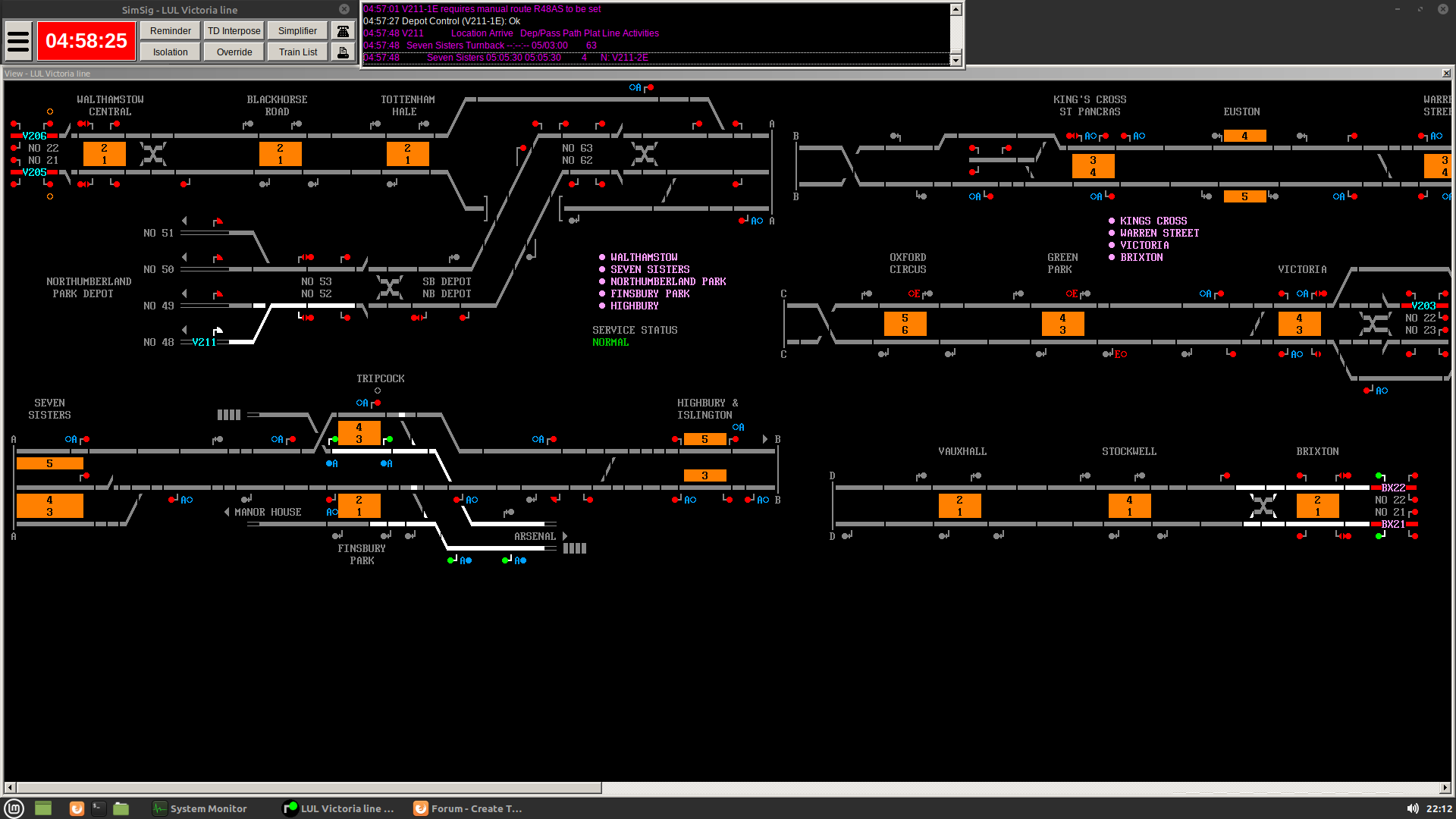
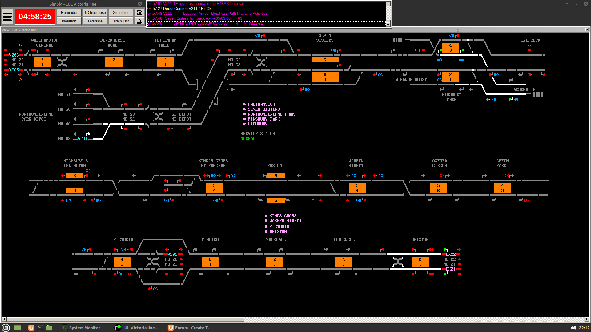
Hi, How would I go about reorganising a pre-existing display to better suit my monitor? I've attached two screenshots, the first of the standard Victoria LUL map, and the second modified with parts rearranged so it all fits on one screen without needing to scroll. I didn't bother reinstating the A|A, B|B etc markings for this one, but they'd be part of whatever final arrangement was used. It's an issue both on my desktop (linux) and laptop (windows), so chances are the map was designed for monitors of a different size? Thanks, DS  
Post has attachments. Log in to view them. Last edited: 17/10/2021 at 11:22 by Anothersignalman Reason: None given Log in to reply |
| Reorganising panel displays? 17/10/2021 at 11:41 #141889 | |
|
Steamer
4033 posts |
You can't move the elements of the display around yourself, that's fixed by the developer. You can, however, create new 'View' windows (Hamburger menu-> Show-> New View) which you can then position on your monitor and scroll to focus on the areas you want to. "Don't stress/ relax/ let life roll off your backs./ Except for death and paying taxes/ everything in life.../ is only for now." (Avenue Q) Log in to reply The following user said thank you: Anothersignalman |
| Reorganising panel displays? 17/10/2021 at 11:51 #141890 | |
|
Anothersignalman
115 posts |
Thanks Steamer. The New View option makes the problem worse by adding extra borders that take up a few more pixels each. I can get both ends of the sim to display (losing the column with Oxford Circus) but I lose part of the middle, effectively making that dark territory. That doesn't matter too much for this particular panel but it would be significant for others. It's not just the Vic LUL sim that has this issue, by the way; as below, Oxted would also be playable if I could reorganise the elements. Am I the only person to have reported this? I guess that means I need to learn how to develop the simulations, at least at the interface level. (I was planning on doing that anyway at some point in the next 5-10 years.) The other option might be to introduce a zoom, say with a range of 80 to 120%? That would also benefit sims like Chicago, which only uses a portion of the screen. Last edited: 17/10/2021 at 16:41 by Anothersignalman Reason: Replace "10-15" with Oxted after rechecking. Log in to reply |
| Reorganising panel displays? 17/10/2021 at 12:16 #141891 | |
|
Phil-jmw
677 posts |
If your PC supports multiple monitors, you can afford it and have the space, I would definitely recommend investing in multiple monitors. Yes, you will still need to scroll (or tab using hot keys) on the largest sims (eg Motherwell, Carlisle, Three Bridges), but for the smaller sims, and most of the mid-size sims with use of the 'New View' feature, you don't need to scroll at all. I have four monitors, and, for example, by using New View I don't need to scroll Hereford, Newport or Cardiff, and still have room for the F4, Show Timetable, Messages, Incident Report and Telephone windows to be permanently open. When I start a new sim I place a marker using a sticky note with an arrow pointing to which side of a monitor boundary it needs to be so when I haven't run one for a while I can open it and set it to the same place without having to resort to memory, and also save photos of screen layout so I can see where the New View windows need to go. On the sticky note marker I also place a number showing how many new views I have open with that sim.
Log in to reply The following user said thank you: Anothersignalman |
| Reorganising panel displays? 17/10/2021 at 12:31 #141892 | |
|
clive
2823 posts |
Anothersignalman in post 141890 said:I've not seen any other such reports, but it's possible I've overlooked them. Since you've done a full proposal, no doubt the author of this sim will be looking at it to see what they think. Anothersignalman in post 141890 said: Sorry, but that's not possibly. For a whole slew of reasons described in the wiki and in other threads, the development tools are restricted to a few trained developers. See, for example, https://www.SimSig.co.uk/Wiki/Show?page=usertrack:faq:can_i_make_my_own_SimSig Log in to reply The following user said thank you: Anothersignalman |
| Reorganising panel displays? 17/10/2021 at 12:41 #141893 | |
|
Anothersignalman
115 posts |
@Phil-jmw, I don't have the space, cash or capacity for multiple monitors, and I don't see that changing any time soon. @clive, thanks for that link, I don't mind waiting and building up credit in the meantime. My main area of expertise really is train graphs and schedules in general, and though I'd like to think I understand the basics of (mechanical) interlocking I haven't yet been able to understand Nock's green book. I don't have any formal education in the field (I'm an urban planner by trade) and most of my experience is trial-and-error in model railway circuitry; I've been building what will effectively be a geographic/freewire relay cabinet for the local club over the last decade and it's nowhere near finished, and it's restricted by having to interface with pre-existing systems which means I can only detect reverse-request, not normal-request or either way confirmed locked, and that's just the start of the challenge. Log in to reply |
| Reorganising panel displays? 17/10/2021 at 16:26 #141900 | |
|
Anothersignalman
115 posts |
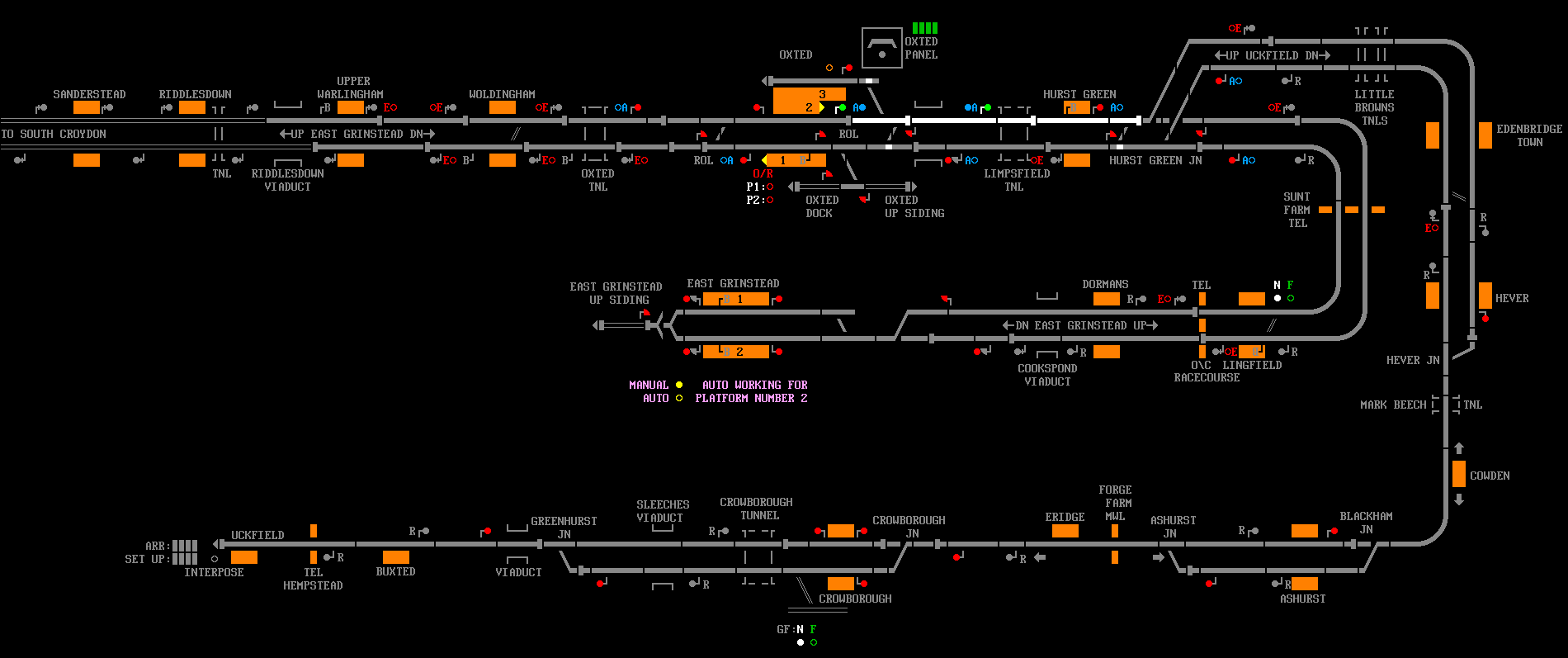
Here's a concept for the reorganisation of Oxted. The East Grinstead branch could be extended to fill the gap (or Sanderstead could be curved down), and I don't know if the curves I've used at the right-hand side are doable? I've gone through the donationware sims again and this appears to be the only other one which is both single-person and capable of fitting on one screen, so I guess the others I noted above must have been from the payware page screenshots. If we assume that my monitor is roughly what most people have, it's 1920x1080px and subtract a few for boundaries etc, I'd suggest a maximum width of 1900px; this makes it about 925px tall. The current bitmap is 2600x528. This page - https://www.hobo-web.co.uk/best-screen-size/ - lists typical screen sizes, ranging from 1366 to 2560px wide, 768 to 1440px tall, roughly 1.8:1.0. 
Post has attachments. Log in to view them. Last edited: 17/10/2021 at 16:40 by Anothersignalman Reason: More detail Log in to reply |
| Reorganising panel displays? 17/10/2021 at 17:46 #141901 | |
|
Stephen Fulcher
2108 posts |
Many sims are drawn the same way as the panels they simulate are drawn in real life, sometimes that doesn’t look pretty but it is authentic. The Oxted suggestion you have posted will not work as you cannot have train descriptions on a vertical plane so the right hand side of the diagram would not work. Log in to reply |
| Reorganising panel displays? 18/10/2021 at 01:25 #141909 | |
|
flabberdacks
680 posts |
Every effort is made to 'draw' the sim layout in the same alignment as the indicator diagram of the signal box being simulated. To me, it is as much about preserving history as it is creating an accurate simulation which is also a fun, playable game - definitely a challenge, as there is a balance to be found. Unfortunately, as has been stated above, the layout of a sim is decided upon by a developer - this generally happens very early on in sim development, as creating the visual layout of a sim is a long and carefully considered piece-by-piece undertaking. Even minor changes to the layout can take hours and hours to get right. Players are not able to change the onscreen layout. I recognise that it is not ideal to play a lot of sims on small monitors. A few aids have been created over the years to give you assistance in that regard - I believe most or all sims have a list of shortcuts you can get to by using the number row on your keyboard (press 1 to go to the leftmost area, then 2, 3 so on). You can also easily scroll from left to right using the mouse wheel or the scroll bar at the bottom of the screen. Hope this helps! Log in to reply |
| Reorganising panel displays? 18/10/2021 at 08:50 #141918 | |
|
Anothersignalman
115 posts |
@Stephen Fulcher - Fair point re the TD describers, I'd missed that. If the lines were spaced further apart there'd be room for four digits on each track, and the three station names could be rotated 90deg. Re authentic/not - at least some sims, like VicLUL, have multiple display options so this is just adding one more. The existing layouts can still be used by those who have the resources to make them work. @flabberdacks - the shortcuts make sense for larger panels, but when you have a narrow column out of shot it's probably overkill. Overall, I accept that developing new panel layouts is a very time-consuming process, but what about adding a general 'zoom' option as a layer across the whole view window (range 80-120%), while leaving the messages and menu bars at normal size? Log in to reply |
| Reorganising panel displays? 18/10/2021 at 10:30 #141921 | |
|
Anothersignalman
115 posts |
I've created a separate thread to discuss the zoom concept here: https://www.SimSig.co.uk/Forum/ThreadView/53465?postId=141920
Log in to reply |
| Reorganising panel displays? 18/10/2021 at 13:14 #141922 | |
|
bill_gensheet
1474 posts |
Anothersignalman in post 141900 said:Here's a concept for the reorganisation of Oxted. The East Grinstead branch could be extended to fill the gap (or Sanderstead could be curved down), and I don't know if the curves I've used at the right-hand side are doable? I've gone through the donationware sims again and this appears to be the only other one which is both single-person and capable of fitting on one screen, so I guess the others I noted above must have been from the payware page screenshots.Interesting thoughts and worth the posting. I use a single 1920x1080 monitor with 'taskbar left' (1850-1080 active), so also do not to use views, but do not find horizontal scrolling or key jumps a huge issue even with bigger sims I use most often (Kings Cross, Motherwell, Edinburgh, CSCOT). I think that following your Oxted proposal could annoy just as many people as it would satisfy. Most accept horizontal scrolling, vertical is far worse to the majority and so is generally avoided if at all possible. I think that your Oxted proposal would feel too high for me at 925px, as I prefer to see a few more message lines as well as parking the phone and F2 or F4 up there. I would also find the 'turning round' to East Grinstead geographically annoying, so a third row running Lingfield (left) - East Grinstead (right) might be better. That would leave getting (moved) split A-A to Uckfield down to one row, which might be tight in 230-240 characters, remembering Simsig is a font display not pixels. Bill Log in to reply |
| Reorganising panel displays? 18/10/2021 at 14:59 #141924 | |
|
Albert
1315 posts |
FWIW: you can scroll vertically by holding the Shift key while scrolling. This might give you easier access to parts of the panel that are off screen.
AJP in games Log in to reply |