Page 4 of 6
| Website improvement ideas 30/01/2019 at 19:07 #115219 | |
|
Dick
387 posts |
GeoffM in post 114919 said:We had a developers' meeting a couple of days ago and one of the points raised was that this website is not friendly to new users. We had intended to discuss it within developers but I don't see why everybody can't be involved.This was the original brief. However, as expected, the thread has evolved into changes for the benefit of regular users. Few contributors are looking at this through the eyes of a potential new user rather than their own eyes. Log in to reply |
| Website improvement ideas 30/01/2019 at 19:57 #115220 | |
|
GeoffM
6376 posts |
JamesN in post 115217 said:Following on from comments elsewhere - a record of when users signed up for a game would be useful; even if only visible to the person who created the game.You're behind the curve - I uploaded that a couple of hours before your post! :) https://www.SimSig.co.uk/Game/Details/6553 But it only applies since 2 hours ago, so 2 in the above game have a date, whereas 2 do not. But they're still in order of joining even without a date. SimSig Boss Log in to reply The following user said thank you: JamesN |
| Website improvement ideas 30/01/2019 at 20:43 #115221 | |
|
KymriskaDraken
963 posts |
Dick in post 115219 said:I'm aware that there are possible data protection issues, but can an email be sent to the last x people that registered to ask for their opinion? Kev Log in to reply |
| Website improvement ideas 30/01/2019 at 21:35 #115222 | |
|
Dick
387 posts |
Good idea, be interesting to see their view.
Log in to reply |
| Website improvement ideas 30/01/2019 at 23:44 #115223 | |
|
RainbowNines
272 posts |
You can at least send a forum PM which has no data implication since they’ve chosen to accept the terms of using the forum.
Log in to reply |
| Website improvement ideas 31/01/2019 at 02:29 #115225 | |
|
postal
5265 posts |
KymriskaDraken in post 115221 said:I'm aware that there are possible data protection issues, but can an email be sent to the last x people that registered to ask for their opinion?Good idea, but that only covers part of the problem. Using the existing customer base misses out on a significant but intangible piece of information. How many people came to the site, looked and decided not to sign up because it looked too intimidating, it looked like it was run by geeks with beards and corduroy trousers or it looked like you had to join in things like a multiplay to get any benefit from the simulations? I am not saying any of those items or stereotypes are the reality and I am certainly not aiming at any individuals. However, as with so many things, it is the first perception rather than the actual situation which will set someone's life-long attitudes. We will never be able to get at any information from people who came, saw and went away disappointed and we don't want to overplay it, but it is something that we should continue to bear in mind and it is something where someone needs to step back and take a dispassionate view whenever a significant change is in the wind. “In life, there is always someone out there, who won’t like you, for whatever reason, don’t let the insecurities in their lives affect yours.” – Rashida Rowe Log in to reply The following user said thank you: Dick |
| Website improvement ideas 31/01/2019 at 02:31 #115226 | |
|
postal
5265 posts |
GeoffM in post 115213 said:Try now.Looks like you've nailed it! “In life, there is always someone out there, who won’t like you, for whatever reason, don’t let the insecurities in their lives affect yours.” – Rashida Rowe Log in to reply |
| Website improvement ideas 31/01/2019 at 13:01 #115229 | |
|
bugsy
1766 posts |
Dick in post 115219 said:GeoffM in post 114919 said:I think that Dick has a point. We need to finalise the much-improved Home page to suit new visitors and then if needs be, deal with any other issues that have been raised (from the point of view of existing members).We had a developers' meeting a couple of days ago and one of the points raised was that this website is not friendly to new users. We had intended to discuss it within developers but I don't see why everybody can't be involved.This was the original brief. Asking newly registered people for their opinion is a good idea. We’ll get some useful feedback. Another way would be if a few members asked some of their friends/acquaintances who have never been to the site to view the SimSig Home page and ask for their opinion as regard to ‘user friendliness’, we could get some more useful feedback. If I can find the time, I will probably do this. As far as I can see, the only example of this so far is given in the post by andyb06097 (post #114592) This is not to say that some members haven’t made useful suggestions, as quite a few have (Clive and Peter in particular). Everything that you make will be useful - providing it's made of chocolate. Log in to reply The following user said thank you: Dick |
| Website improvement ideas 31/01/2019 at 16:31 #115230 | |
|
norman B
111 posts |
Just to draw breath for a little while,are we not discussing two separate items here? We have a website which can be used by many types of pad ,phone and desktop and I do think that it is very difficult to achieve a one size fits all solution. Reading the posts ,it becomes apparent that some suggestions make sense from a mobile users pov while at the same time as a desktop user I wonder what all of the fuss is about. As someone who does not have a mobile phone,nor has any need of one ,I have asked another family member for comments and the first and only comment was that the mobile offering is not at all user friendly in its current state. So I would suggest that two differing approaches are needed along with a degree of standardisation as to the page layouts and content of all things Wiki related. Log in to reply |
| Website improvement ideas 31/01/2019 at 16:49 #115231 | |
|
Dick
387 posts |
Not really, I only use a desktop to view the site. My point is not about the layout and how the site is presented per se, it is about the image it gives. Postal has put it far more eloquently in post 115225.
Log in to reply |
| Website improvement ideas 31/01/2019 at 23:12 #115241 | |
|
SamTDS
153 posts |
The new landing page for users not logged in looks amazing, when I get the time around being busy il make a new section on wiki away from main content to work on a wiki overhaul to try and standardise the layout. I think some of the sim manuals can do with some better clarification such as me and Kymriska found with Salisbury and have rectified. As for mobile I will get on the site with my phone when I have spare time and try to assist on the mobile front. One part I find on mobile site that I haven't before had but would like to see is when signed in to be able to see the shoutbox on mobile even if under a menu such as the user account dropdown menu and showing on a separate page. Edit: wiki pages new subscribe feature could do with a pipe character "|" before the subscribe button to fit in with the wiki edit buttons SamTDS - STDS | My comments are my opinions and interpretations and do not reflect on the wonderfull SimSig team. I am in no way part of the team. Last edited: 31/01/2019 at 23:17 by SamTDS Reason: None given Log in to reply |
| Website improvement ideas 01/02/2019 at 15:51 #115251 | |
|
Steamer
3985 posts |
SamTDS in post 115241 said:Twhen I get the time around being busy il make a new section on wiki away from main content to work on a wiki overhaul to try and standardise the layout.Please be aware that work is underway on creating a standard template for simulation manuals- I expect everyone will have the chance to comment on the proposed template before it becomes official. So please don't put effort in to re-structuring pages just yet- I wouldn't want your work to go to waste. Quote: Edit: wiki pages new subscribe feature could do with a pipe character "|" before the subscribe button to fit in with the wiki edit buttonsLooks like this has been logged on Mantis. "Don't stress/ relax/ let life roll off your backs./ Except for death and paying taxes/ everything in life.../ is only for now." (Avenue Q) Log in to reply |
| Website improvement ideas 01/02/2019 at 16:36 #115254 | |
|
SamTDS
153 posts |
Steamer in post 115251 said:SamTDS in post 115241 said:ive got a little bit starting with the syntax underway and identified some issues in the wiki system which prevents the syntax page from working. I made the area and now at least we have a specified area for things to go while testing and building and for quality assurance by the community. I find it to be quite therapeutic working on themTwhen I get the time around being busy il make a new section on wiki away from main content to work on a wiki overhaul to try and standardise the layout.Please be aware that work is underway on creating a standard template for simulation manuals- I expect everyone will have the chance to comment on the proposed template before it becomes official. So please don't put effort in to re-structuring pages just yet- I wouldn't want your work to go to waste. SamTDS - STDS | My comments are my opinions and interpretations and do not reflect on the wonderfull SimSig team. I am in no way part of the team. Log in to reply |
| Website improvement ideas 02/02/2019 at 00:25 #115263 | |
|
RainbowNines
272 posts |
Steamer in post 115251 said:SamTDS in post 115241 said:Steamer, I’m happy to lend my hand at bringing current and future pages into line with the agreed template, if needed.Twhen I get the time around being busy il make a new section on wiki away from main content to work on a wiki overhaul to try and standardise the layout.Please be aware that work is underway on creating a standard template for simulation manuals- I expect everyone will have the chance to comment on the proposed template before it becomes official. So please don't put effort in to re-structuring pages just yet- I wouldn't want your work to go to waste. Last edited: 02/02/2019 at 00:28 by RainbowNines Reason: None given Log in to reply The following users said thank you: GeoffM, Steamer |
| Website improvement ideas 02/02/2019 at 04:41 #115264 | |
|
postal
5265 posts |
Quick thought about the logged-in home page I am currently seeing. The top item of the main section has three splashes (Welcome, Stockport and Manchester South, and Hereford and Port Talbot). The Stockport and Manchester South newsflash is supported by a screen shot of part of a panel which is definitely not from either of those areas. It would be preferable if supporting shots could be appropriate to the message. While I am here, the homepage when you are not logged in includes a section about joining in with your friends. People who are new to SimSig would probably not want to join in and potentially expose their errors and mistakes until they have had a few tries on a solo basis to try and get their heads round things so this section may put too much emphasis on the multiplay side of things. Perhaps a sentence at the start of that paragraph about most/many/some (delete as appropriate) SimSig users work on a solo basis. However, the capability is built in to SimSig so that you can link to other users and play on a collaborative basis if you wish then the puff for multiplay sessions. “In life, there is always someone out there, who won’t like you, for whatever reason, don’t let the insecurities in their lives affect yours.” – Rashida Rowe Log in to reply The following user said thank you: norman B |
| Website improvement ideas 02/02/2019 at 09:04 #115266 | |
|
Andrew G
552 posts |
postal in post 115264 said:People who are new to SimSig would probably not want to join in and potentially expose their errors and mistakes until they have had a few tries on a solo basis to try and get their heads round thingsNot sure this is always evidenced in public sessions - anyway onto the main points. Personally I'd remove the 'News Flash' section and replace it with 'Latest News' and 'Recently Released Simulations'. The first item would be restricted to the latest news item which might be a new release, a significant upgrade to an existing simulation (e.g. Simulation X has been upgraded from a .exe sim to a loader sim) or a sales promotion. The second item would list several of the latest releases along with a hyper link to the respective page in the Shop. In Brief specs I'd refer to 'Accurate' or 'Realistic' signalling rather than 'Correct' signalling. Possibly more inclined towards 'Realistic' given that some simulations may have been developed without access to control tables. Not quite sure of the relevance to the 'Emphasis is on quality and realism, given that there are a relatively large number of simulations available. 'Rail' could do with being added to the front of 'professionals from all over the world'. And the second last bullet could read 'User orientated - our active community helps to influence future developments'. 'How much is it?' might be a bit softer as 'What does it cost?'. I've noted below a suggested rewrite for 'Can I play with friends?'. While I agree with Postal that there needs to be a balance between Solo and Multi Play - which to be fair is reflected in the current text - I think it is important not to give the impression that I need to have friends interested in Railway Signalling to get full value from the product. Anyway that is my tuppenceworth. Note referred to above: SUPPORTS SOLO PLAYERS AND MULTIPLAYER SESSIONS There is a wide range of simulations from relatively simple simulations suitable for a beginner, moderate simulations suitable for more experienced users and complex simulations which have as many as nine positions. Many of the complex simulations also have optional automation such as ARS (Automatic Route Setting) which means you can still run some of these simulations by yourself. Multiplayer works over the Internet or your home LAN. One person acts as the host while others connect with an IP address and Port Number. We have run multiplayers across the world with members in the UK, the US, Australia, Europe, and elsewhere. Many simulations can be "chained", which is where adjacent areas can be linked together to form a larger area. Public sessions are hosted by our community on a regular basis and details of these can be found in our Upcoming Games section. In addition some of our users host private sessions with friends. Technical support for new hosts is available in our Documentation section and via the Forum. Last edited: 02/02/2019 at 10:42 by Andrew G Reason: Typo Log in to reply The following users said thank you: norman B, postal, KymriskaDraken, Temple Meads |
| Website improvement ideas 02/02/2019 at 18:31 #115274 | |
|
clive
2789 posts |
Steamer in post 115251 said:Also please note that some devs have asked for the new manual pages to be write-protected after some previous occasions where people have made erroneous or opinionated edits. Log in to reply The following users said thank you: DriverCurran, headshot119, JamesN |
| Website improvement ideas 02/02/2019 at 19:27 #115278 | |
|
GeoffM
6376 posts |
Can I have some feedback on some CSS improvements made to https://staging.SimSig.co.uk/ please? Yes, I know there is no certificate, and the layout is a few days old (especially the Upcoming Games bit), but I'm interested in the visual effects when resizing the browser window, and generally the experience on iPads since they seemed to be a problem before. Thanks. SimSig Boss Log in to reply |
| Website improvement ideas 02/02/2019 at 21:49 #115280 | |
|
Steamer
3985 posts |
GeoffM in post 115278 said:Can I have some feedback on some CSS improvements made to https://staging.SimSig.co.uk/ please? Yes, I know there is no certificate, and the layout is a few days old (especially the Upcoming Games bit), but I'm interested in the visual effects when resizing the browser window, and generally the experience on iPads since they seemed to be a problem before.Using Firefox on laptop. The banner advert is laid out differently on the first slide to the other two; the whole thing also needs shrinking vertically, as at the moment it's stretched and the pictures don't look right. The slight narrowing of the sidebar looks good, and the fixing of the bullet points issue on the Wiki is appreciated; can the ' -' syntax be formatted as a numbered list? "Don't stress/ relax/ let life roll off your backs./ Except for death and paying taxes/ everything in life.../ is only for now." (Avenue Q) Last edited: 02/02/2019 at 21:50 by Steamer Reason: None given Log in to reply |
| Website improvement ideas 03/02/2019 at 15:26 #115294 | |
|
y10g9
895 posts |
GeoffM in post 115278 said:Can I have some feedback on some CSS improvements made to https://staging.SimSig.co.uk/ please? Yes, I know there is no certificate, and the layout is a few days old (especially the Upcoming Games bit), but I'm interested in the visual effects when resizing the browser window, and generally the experience on iPads since they seemed to be a problem before.Hi Geoff I've had a look at the staging version of the website, looking at it on my iPad which generally is the device that I use to view the website/forum on. I always view the desktop version of the website/forum on my iPad and the staging version definitely made it feel I was getting the same website I view on my computer. The side bar was always something that didn't work in the current version, either being overridden by the forum module, or being a sore tooth and causing you to have to scroll down to see the news flash, while just sitting there, being unable to click on any links and only being able to post in the shout box by pressing the enter key (I don't remember that being an available when I've tried to post previously) Having looked at the staging version, the side bar and forum/news flash/pretty much any other page sit nicely next to each other, and whatever was causing the side bar to not be able to clicked in has dissappeared allowing the website to be full navigable in the same way as I can on my laptop, and also being able to send messages in the shout box is fully possible (useful for when you're in a multiplayer game and your laptop decides to crash/restart/do everything else under the sun) I've attached a few before and after screenshots below (and in second post) Current logged in home page top 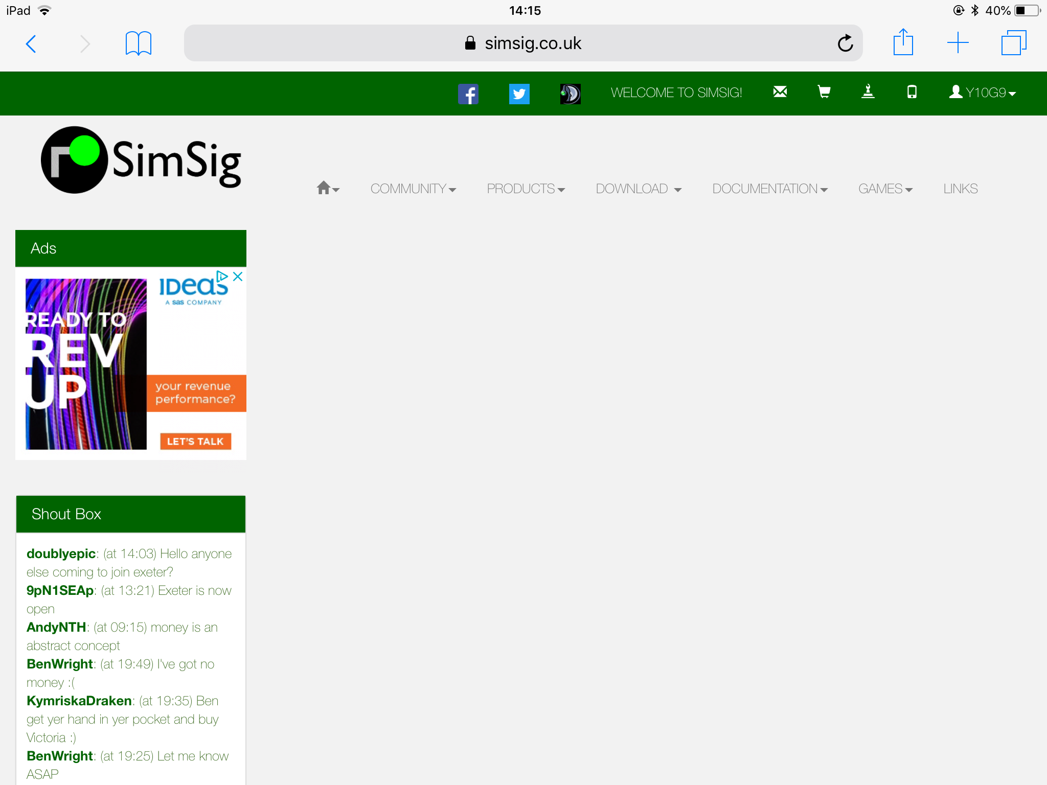 Current logged in home page with News Flash under side bar 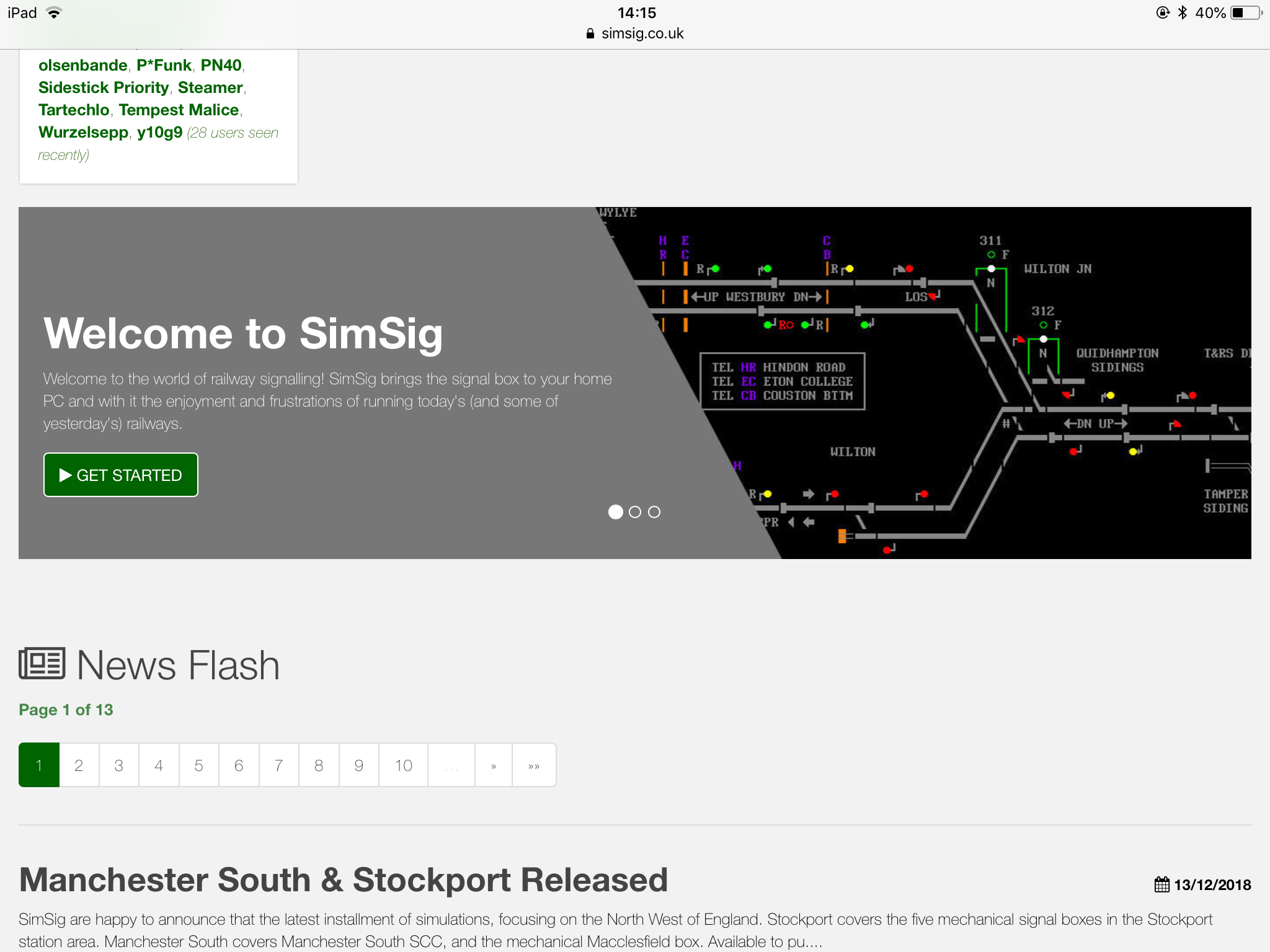 Staging Home Page 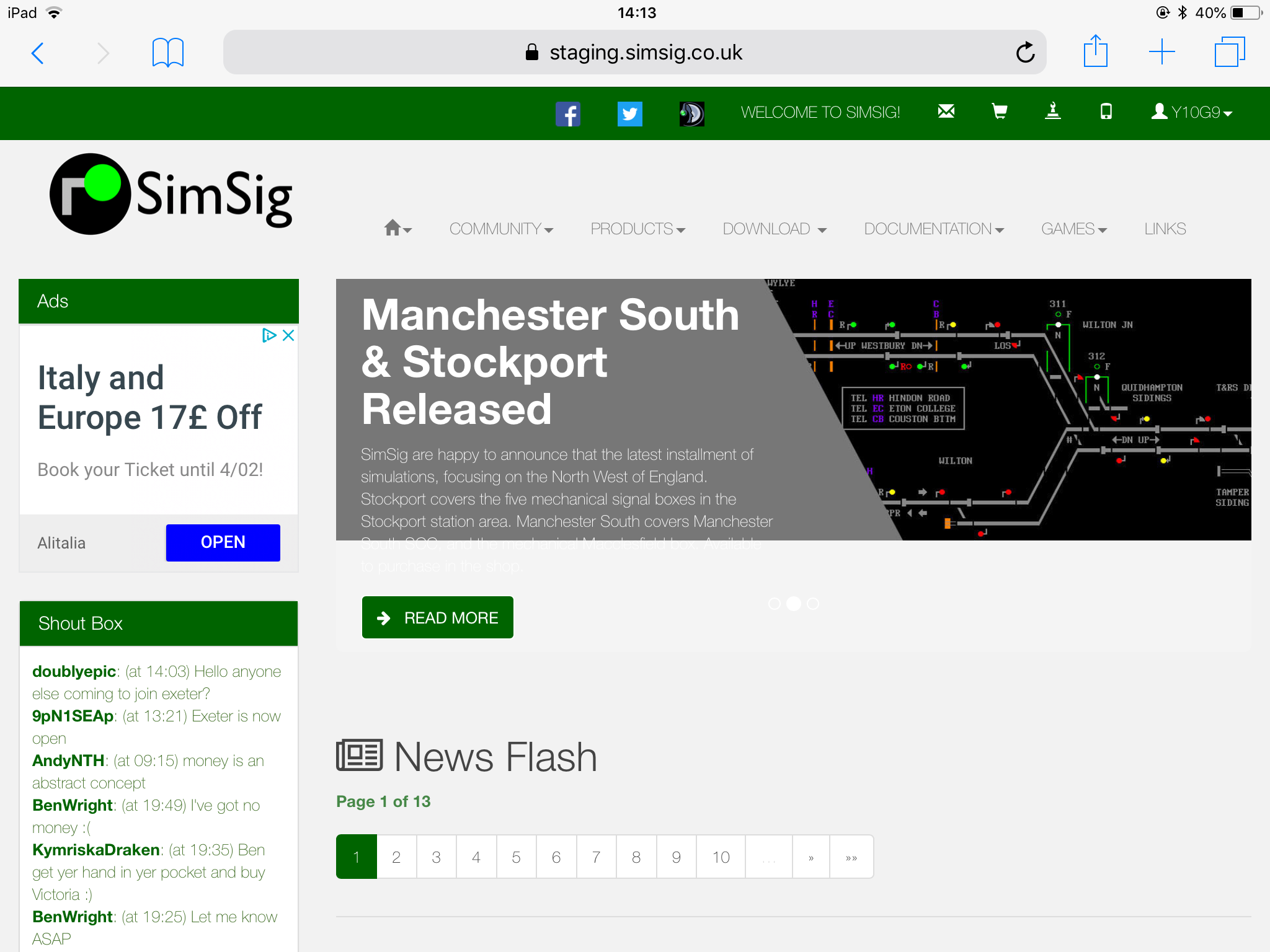
Post has attachments. Log in to view them. Last edited: 03/02/2019 at 15:28 by y10g9 Reason: None given Log in to reply The following user said thank you: KymriskaDraken |
| Website improvement ideas 03/02/2019 at 15:26 #115295 | |
|
y10g9
895 posts |
Forum Page with side bar blocked from view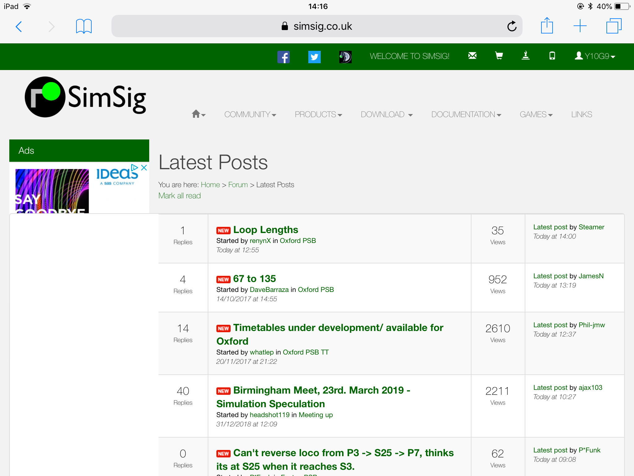 Staging Forum Page with side bar visible and clickable 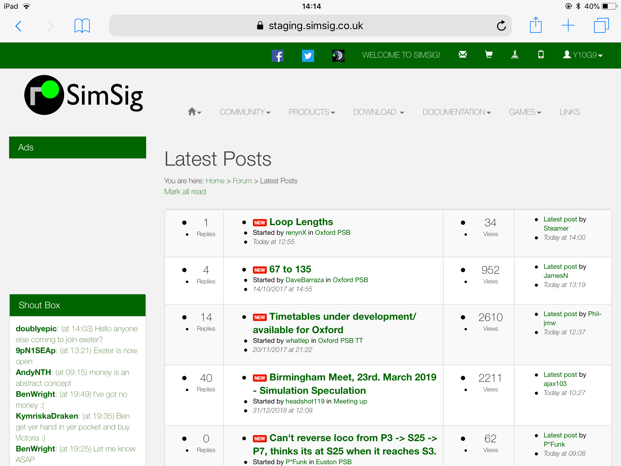
Post has attachments. Log in to view them. Last edited: 03/02/2019 at 15:29 by y10g9 Reason: None given Log in to reply |
| Website improvement ideas 03/02/2019 at 16:02 #115298 | |
|
KymriskaDraken
963 posts |
I was having the same issues as y10g9 on my MacBook but with the new version everything behaves as it should. Links on the left-hand side have become clickable again, and if the window is shrunk the page resizes properly. Kev Log in to reply |
| Website improvement ideas 04/02/2019 at 17:26 #115349 | |
|
GeoffM
6376 posts |
Thanks. Is there anything else CSS-related (not content) that I need to get him to work on not already mentioned here?
SimSig Boss Log in to reply |
| Website improvement ideas 04/02/2019 at 22:26 #115358 | |
|
GeoffM
6376 posts |
Peter Bennet in post 115140 said:Fixed - it was not updating threads already read recently; only those that had never been read (d'oh). In other news, users can now post to Games and Events. The idea of these Game/Event posts is to ask the host questions, or make suggestions, rather than creating a forum thread to do so. It's a simplified forum view, single thread in effect. The host will get email notification that somebody has posted so I've put a note on the post page to say that things like thank yous and other simple acknowledgements are not required, lest the host get too many notifications. I am going slowly through all the comments in this thread. I'm not ignoring any suggestions - I will comment as and when. SimSig Boss Last edited: 04/02/2019 at 22:27 by GeoffM Reason: None given Log in to reply |
| Website improvement ideas 05/02/2019 at 04:57 #115362 | |
|
AndyNTH
31 posts |
Hi Geoff, The updates so far are most welcomed and I particularly enjoy the slightly revamped hosting section. It would be nice if you could have an "Add next game" button on a host which would open the "Add a game" form autofilled with the details of the game you selected, so you just need to change the date to continue a host. Now that TeamSpeak is being used more predominantly it would be nice to have a link to the thread where details are provided in the menu system somewhere, or perhaps even a toggle in the hosting section to display clearly that TeamSpeak will be in use. Andrew Log in to reply |