Page 1 of 2
| Alternative panel designs 04/11/2021 at 05:53 #142177 | |
|
Anothersignalman
115 posts |
Hi all, Not sure whether or not this is the right place to put this. In theory, would it be possible to use the Simsig background system with a different style of bitmap layout to reflect non-PC-based panel designs? For instance, the attached photo and sketches of Oakleigh panel in Melbourne, Victoria, which was brought into use in 1975, abolished in 2018 and removed a year later. The main difference is that there were a series of illuminated route buttons, i.e. "8 to 22", at the bottom half of the panel which could be pressed to set the route or lifted to release the route, which could be mapped to left- and right-clicking respectively? (This is ignoring the whole other set of work that would be needed to develop Victorian speed signalling.) 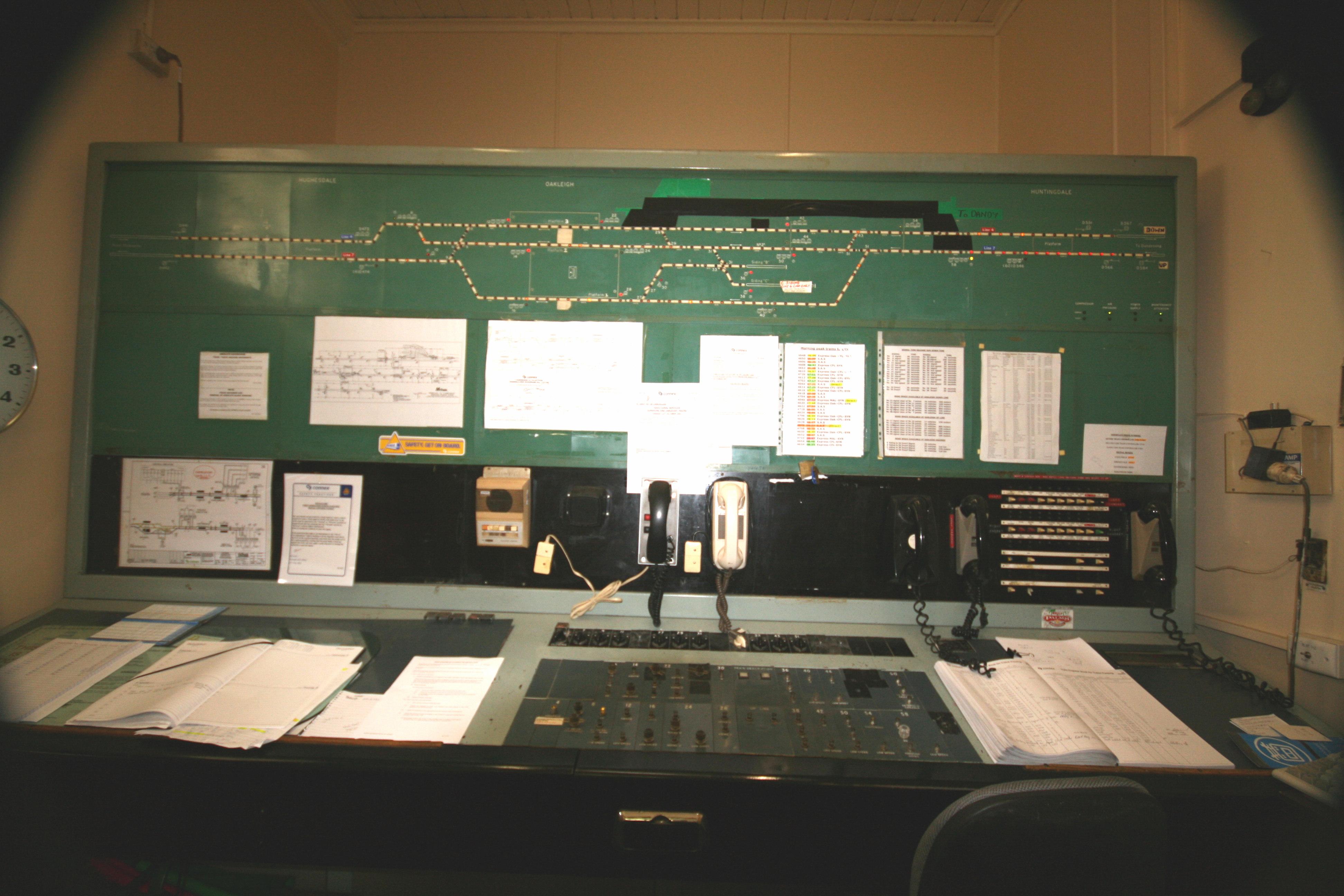 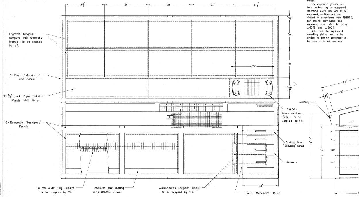 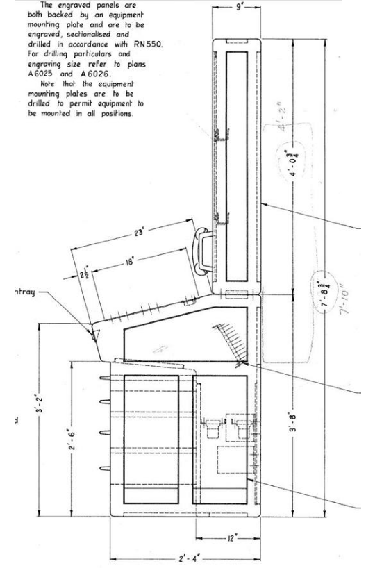 Post has attachments. Log in to view them. Log in to reply |
| Alternative panel designs 04/11/2021 at 07:09 #142178 | |
|
Peter Bennet
5437 posts |
One of the launch options in the Cathcart sim gives this kind of layout. Peter I identify as half man half biscuit - crumbs! Log in to reply The following user said thank you: Anothersignalman |
| Alternative panel designs 04/11/2021 at 07:46 #142179 | |
|
Stephen Fulcher
2108 posts |
headshot119 and pedroathome have used the gateway with (I think) arduinos to enable physical switches and LEDs to operate SimSig functions. There is a lot of information in the wiki of the gateway and how it works. Log in to reply The following user said thank you: Anothersignalman |
| Alternative panel designs 04/11/2021 at 07:47 #142180 | |
|
Anothersignalman
115 posts |
Thanks Peter and Stephen. Cathcart is part of what I'm suggesting; the other change would be swapping the artwork from black background to pale green and other aesthetic changes. Log in to reply |
| Alternative panel designs 04/11/2021 at 08:56 #142181 | |
|
Steamer
4033 posts |
In theory, you could write a program which displayed a track plan, controls etc, with a back end that received Gateway messages (to display track and other object statuses) and converted interactions with your program to route requests etc. As detailed on the Wiki, the Gateway has no concept of mouse clicks. "Don't stress/ relax/ let life roll off your backs./ Except for death and paying taxes/ everything in life.../ is only for now." (Avenue Q) Last edited: 04/11/2021 at 09:00 by Steamer Reason: None given Log in to reply |
| Alternative panel designs 04/11/2021 at 10:53 #142184 | |
|
clive
2823 posts |
Steamer in post 142181 said:In theory, you could write a program which displayed a track plan, controls etc, with a back end that received Gateway messages (to display track and other object statuses) and converted interactions with your program to route requests etc.I think there's a crossed line here. The original request, as I read it, is for a simulation that looks and works a lot more like the panel in the photograph. It's not to do with physically interfacing a panel to SimSig. Just about all the colours in a simulation can be changed by the sim author. So a green background is perfectly possible, even trivial. (At present there's a fixed palette of 12 or so colours; it would require a core code change to further ones.) The default colour for a track circuit could be made black instead of grey, or use yellow for main routes and orange for shunt routes, and so on. You can have clickable areas on the screen ("buttons"  with actions for left and right click (but not for drag or double-click). These actions can be combined so that you click on a sequence of buttons to do something. These can change appearance as things happen, either from user action or events in the sim. See the SPAD alert in Euston for an example. with actions for left and right click (but not for drag or double-click). These actions can be combined so that you click on a sequence of buttons to do something. These can change appearance as things happen, either from user action or events in the sim. See the SPAD alert in Euston for an example.The sim developers have the tools for all of these. But all this has to be done by the sim author; it can't be done by anyone else. Yes, you could use the gateway to have a completely different sort of appearance. But that feels to me like the hard way to do it. Log in to reply |
| Alternative panel designs 04/11/2021 at 11:53 #142185 | |
|
Jan
923 posts |
But you're still limited by the possibilities of Simsig's bitmap font, so if you want to model really all details like the tile boundaries, the individual track circuit and route lights, a more accurate button representation, the various small labels, etc. etc., you still couldn't do it within the current boundaries of Simsig itself.
Two million people attempt to use Birmingham's magnificent rail network every year, with just over a million of them managing to get further than Smethwick. Log in to reply |
| Alternative panel designs 04/11/2021 at 15:09 #142186 | |
|
clive
2823 posts |
Actually, you can do the individual lights (though it's painful). Buttons can be any character in the font. I'll give you tile boundaries and small labels, though. (Though we are looking at a version of small labels, though not quite the same.)
Log in to reply |
| Alternative panel designs 04/11/2021 at 19:38 #142191 | |
|
Anothersignalman
115 posts |
clive in post 142184 said:Just about all the colours in a simulation can be changed by the sim author. So a green background is perfectly possible, even trivial. (At present there's a fixed palette of 12 or so colours; it would require a core code change to further ones.) The default colour for a track circuit could be made black instead of grey, or use yellow for main routes and orange for shunt routes, and so on. Good to know. Since I'm not developing a sim but I can put together an example bitmap, as long as I keep it to any 12 or fewer total colours it should be fine? Log in to reply |
| Alternative panel designs 04/11/2021 at 19:48 #142192 | |
|
Peter Bennet
5437 posts |
Here's Cathcart in light grey, which is the closest I can get to the colour of the panel when I visited. Peter 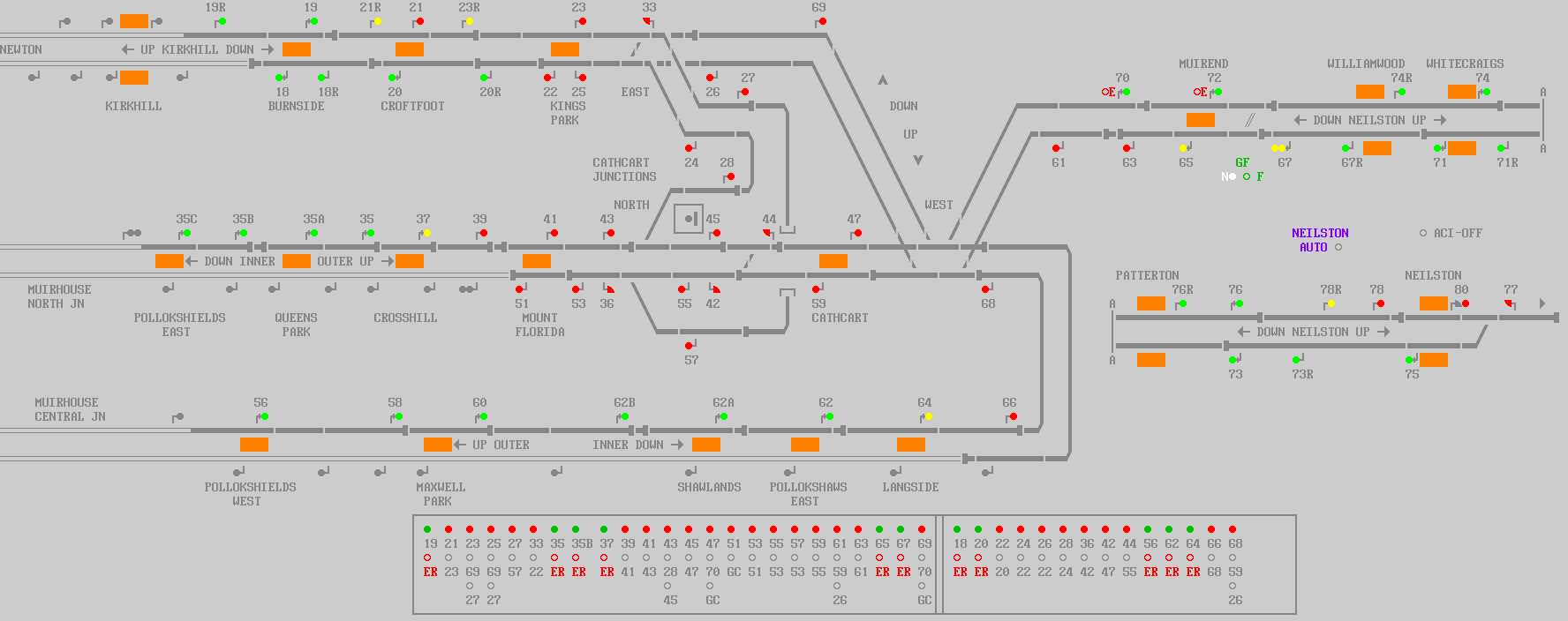 Post has attachments. Log in to view them. I identify as half man half biscuit - crumbs! Log in to reply The following user said thank you: Anothersignalman |
| Alternative panel designs 04/11/2021 at 20:11 #142193 | |
|
jc92
3734 posts |
Out of interest, presumably black and dark grey is the standard as its most friendly to the eye if stared at for long periods?
"We don't stop camborne wednesdays" Log in to reply |
| Alternative panel designs 04/11/2021 at 21:25 #142194 | |
|
Jan
923 posts |
clive in post 142186 said:Buttons can be any character in the font. Yes, but what I meant is that currently the font doesn't have any graphics mimicking real panel buttons, does it? Two million people attempt to use Birmingham's magnificent rail network every year, with just over a million of them managing to get further than Smethwick. Log in to reply |
| Alternative panel designs 04/11/2021 at 22:44 #142195 | |
|
Stephen Fulcher
2108 posts |
Not entirely surprising though as it is an IECC simulation. Could just use a large roundel and make it flash for entrance, would just not have the arrows on it. Log in to reply |
| Alternative panel designs 04/11/2021 at 22:56 #142196 | |
|
clive
2823 posts |
Anothersignalman in post 142191 said:clive in post 142184 said:Not any 12, a fixed 12.Just about all the colours in a simulation can be changed by the sim author. So a green background is perfectly possible, even trivial. (At present there's a fixed palette of 12 or so colours; it would require a core code change to further ones.) The default colour for a track circuit could be made black instead of grey, or use yellow for main routes and orange for shunt routes, and so on. But in fact, it turns out that my memory is behind what I actually implemented a while ago. The following 17 colours are available: black blue dark blue brown cream crimson cyan green dark green light grey grey pink purple red stone (orange) white yellow and in addition the sim author can pick any 10 RGB values to be available as well, making 27. Log in to reply The following users said thank you: Anothersignalman, AlexRail575 |
| Alternative panel designs 04/11/2021 at 23:59 #142197 | |
|
Anothersignalman
115 posts |
Thanks Clive. Do those colours correspond to the options in MS paint, i.e. have I picked the correct 17 of these 28 or are some missing?   Post has attachments. Log in to view them. Log in to reply |
| Alternative panel designs 05/11/2021 at 15:43 #142202 | |
|
Albert
1315 posts |
You left out cyan which is in Clive's list, instead you selected teal which is on top of it. It seems to me that at least the pink colour (used for electrification boundaries on some sims) doesn't match exactly, so I think you can't compare this one-to-one to Paint. AJP in games Log in to reply |
| Alternative panel designs 06/11/2021 at 15:39 #142211 | |
|
AlexRail575
136 posts |
clive in post 142196 said:I've added the exact hex values (based on simply looking at a few screenshots in paint) - there's a few lesser used colours which I'm unsure about. Last edited: 06/11/2021 at 15:41 by AlexRail575 Reason: complete fix of irregular table-like formatting Log in to reply The following user said thank you: Anothersignalman |
| Alternative panel designs 06/11/2021 at 15:49 #142212 | |
|
AlexRail575
136 posts |
Jan in post 142185 said:But you're still limited by the possibilities of Simsig's bitmap font, so if you want to model really all details like the tile boundaries, the individual track circuit and route lights, a more accurate button representation, the various small labels, etc. etc., you still couldn't do it within the current boundaries of Simsig itself.Yes. I know of at least one online "sim" (probably not as accurate SimSig...) which has a more panel-like feel to it (see attached pic - of course it's not based on UK models so the colours are different). Reproducing that kind of look seems out-of-scope for a simple bitmap font; although you can probably get close at least for the colour scheme.  Post has attachments. Log in to view them. Log in to reply The following user said thank you: Anothersignalman |
| Alternative panel designs 06/11/2021 at 23:23 #142213 | |
|
Anothersignalman
115 posts |
Does that mean, for example, that the Cathcart panel above uses empty and full bullet points for the buttons instead of drawn circles? That would make it a bit more challenging but not impossible...
Log in to reply |
| Alternative panel designs 06/11/2021 at 23:52 #142214 | |
|
Peter Bennet
5437 posts |
Anothersignalman in post 142213 said:Does that mean, for example, that the Cathcart panel above uses empty and full bullet points for the buttons instead of drawn circles? That would make it a bit more challenging but not impossible...Essentially the buttons are made of two picture elements that switch from one to the other when you click. However, because of reminder states, there are actually more than two pictures involved. Peter I identify as half man half biscuit - crumbs! Log in to reply |
| Alternative panel designs 07/11/2021 at 00:02 #142215 | |
|
Anothersignalman
115 posts |
Peter Bennet in post 142214 said:Anothersignalman in post 142213 said:Ah, so in that case for the track circuits instead of white, red and grey rectangles, I can use whatever I want within the available colours as long as I show all states?Does that mean, for example, that the Cathcart panel above uses empty and full bullet points for the buttons instead of drawn circles? That would make it a bit more challenging but not impossible...Essentially the buttons are made of two picture elements that switch from one to the other when you click. However, because of reminder states, there are actually more than two pictures involved. Log in to reply |
| Alternative panel designs 07/11/2021 at 00:14 #142216 | |
|
Anothersignalman
115 posts |
So for this style of artwork, I'd need a red, yellow and black version of each track section, plus signals with red or green LEDs under them. does that sound right? Post has attachments. Log in to view them. Log in to reply |
| Alternative panel designs 07/11/2021 at 00:46 #142217 | |
|
AlexRail575
136 posts |
Depending upon what exactly you want to simulate and what exactly would need to appear on the panel, that seems like a start, yes (if you have British-style repeaters, then that's another signal colour; also, I have no clue about Australian panels, but if the position of points needs to be displayed, that's another element which needs to be simulated/displayed properly)... Then if you get to British-style panels (ex. like here) you need all of the above + a few other details.
Log in to reply The following user said thank you: Anothersignalman |
| Alternative panel designs 07/11/2021 at 03:51 #142218 | |
|
Anothersignalman
115 posts |
AlexRail575 in post 142217 said:Depending upon what exactly you want to simulate and what exactly would need to appear on the panel, that seems like a start, yes (if you have British-style repeaters, then that's another signal colour; also, I have no clue about Australian panels, but if the position of points needs to be displayed, that's another element which needs to be simulated/displayed properly)... Then if you get to British-style panels (ex. like here) you need all of the above + a few other details. This panel was unique since it was an experiment of the new type; the individual circuit cards had components soldered in place by hand, and it was written up in the IRSE Australia journal at the time. Points were indicated at the levers (left = normal, right = reverse, centre = automatic per route-setting); the centre red light was 'out of correspondence' and usually flashed 3-5 times during the point throw. On the panel the track circuit bicolour LEDs showed the lie of the points only when a route was called (yellow) or occupied (red). Attached is what the panel might have looked like in normal SimSig format; there were more track circuits in the area but the panel didn't distinguish between them, so not sure if they need to be shown here and/or included in any part of the program? For example, later in life a pedestrian crossing was added between D373-8 and 10-D474 with the relevant track circuits split to operate the gates, but the panel still considered both halves of those circuits as a combined entity (probably via a diode matrix). I think this could be an interesting simulation at various eras because it included overtaking moves in both directions at various times, loco runarounds and train stabling, and additionally in bad weather all trains would be routed via No.3 road in both directions because the underpass would flood and be impassable. Also, catch 27 was placed badly so a train derailing there would foul the up main - this happened at least twice. From the late 90s the panel was only switched in during peak hours, but signalling staff were always available to switch in at a moment's notice if requested for overtaking moves in either direction; this probably happened at least twice a month. (As an aside, after the panel was abolished and the line straight-railed, the train controllers still asked Oakleigh to switch in occasionally because they forgot it wasn't an option anymore...) The attached shows a Simsig-style layout with BR-style signals in lieu of speed signalling, but otherwise with the controls more or less as they existed on the actual panel, in the period after the yard was abolished but before the through siding was removed. Notable is that even when switched out, points 31 and signals 36 and 38 were available; and quite a few LEDs failed over time and weren't replaced, including the green for post 16. The route buttons were pressed to call, lifted to cancel. I don't recall exactly but I think the signals could be called into an occupied section or with points against the move, with the yellow light flashing until the route came available. I don't know how to create a Simsig simulation and I understand that's not something I can just apply for, but if one of the current developers is willing to give this a crack I'm happy to do the MS paint artwork. 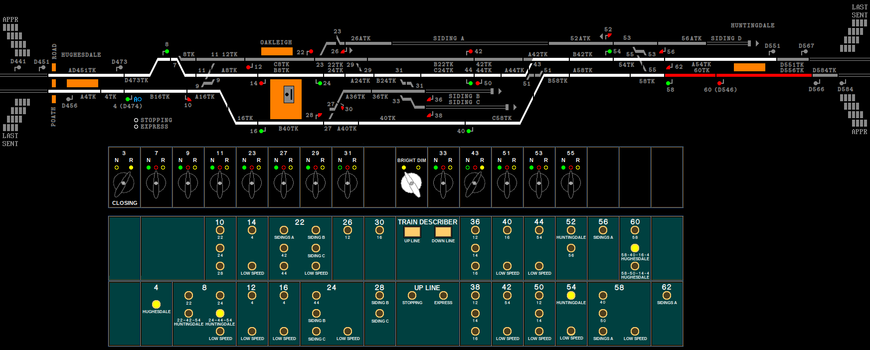
Post has attachments. Log in to view them. Last edited: 07/11/2021 at 03:57 by Anothersignalman Reason: None given Log in to reply |
| Alternative panel designs 07/11/2021 at 11:46 #142219 | |
|
clive
2823 posts |
But in fact, it turns out that my memory is behind what I actually implemented a while ago. The following 17 colours are available, now with the RGB values in the code: black 000000 blue 00A0FF dark blue 000088 brown 8B4500 cream FFFFA0 crimson 880000 cyan 00FFFF green 00FF00 dark green 00C000 light grey CCCCCC grey 888888 pink FFA0FF purple 8000FF red FF0000 stone (orange) FF8000 white FFFFFF yellow FFFF00 Log in to reply The following user said thank you: Anothersignalman |